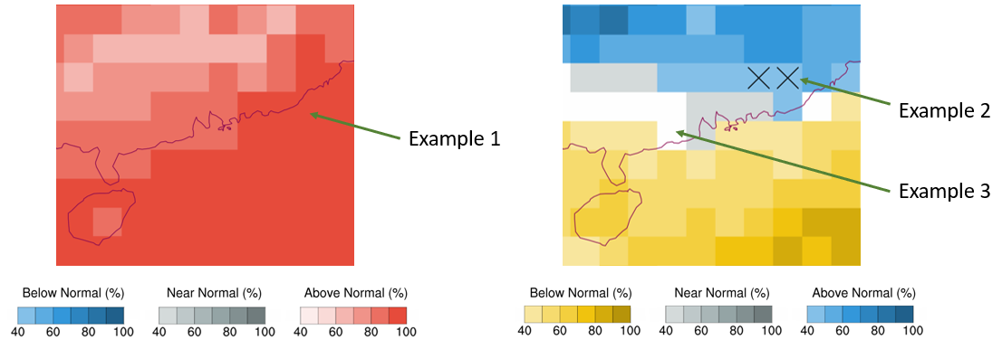
- The above diagrams show the categorical probabilistic forecasts of monthly mean temperature and rainfall for the next month.
- Updated once a month around the end of each month, the probabilistic forecast is automatically generated by computer using data from ensemble prediction systems of sub-seasonal weather forecast models. The Monthly Forecast issued by forecasters is based on various meteorological observations, computer forecast model products and past forecast experience. As the two forecast methods are different, there could be differences between the two forecasts. Please click here for the latest Monthly Forecast.
- The colours in the graph represent a higher chance that the temperature or rainfall will be within that category range. The darker colour represents a higher chance, while the white colour indicates no signal. The symbol ✖ identifies situations with greater uncertainty (see Example 2).
- Take the temperature and rainfall forecast map as an example:
Example 1: The darkest red colour means that there is over a 90% chance that the temperature will be “above normal”.
Example 2: The blue colour with the symbol ✖ means that the chance of "above normal" and "near normal" rainfall is the same and equally higher (more than 40%).
Example 3: The white colour means that there is no signal in the probabilistic forecast of rainfall.
|